Core Tip: This year, the most popular color is probably a powder crystal. For most people, the powder crystal color "turned out" is Pantong's decision. Is that true?
Ask a question first: What are humans actually discussing when discussing colors?
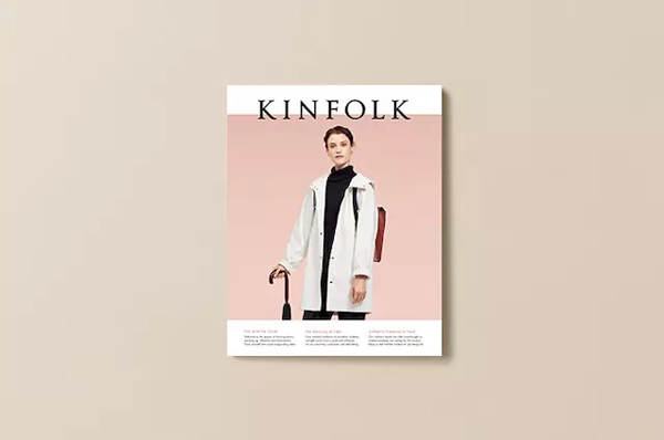
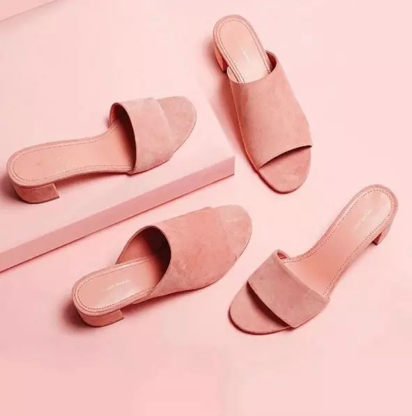
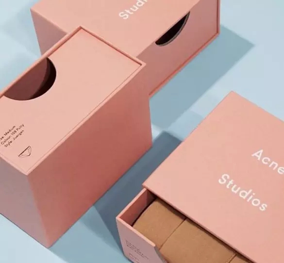
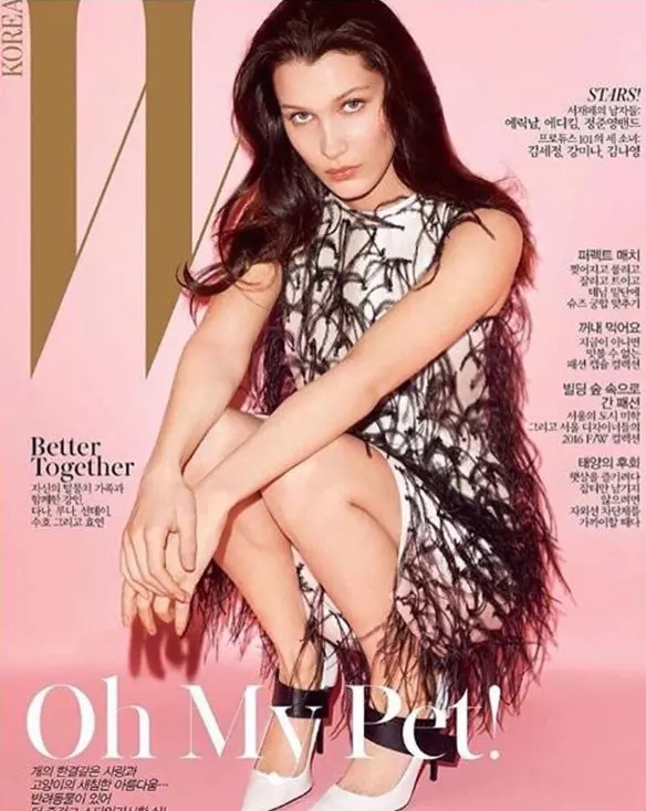
This year, the most popular color is probably a powder crystal. At the end of 2015, Pantone, the most authoritative institution in color, announced that the color of the crystal was “popular color of the yearâ€. This color, which was very hot on the light blog site Tumblr, appeared in everything you could. Shang - Calvin Klein's advertising, Party Hadid's Givenchy, Cosmetic Glossier's packaging Gucci's catwalk, Kinfolk's magazine cover, Acne's packaging, Everlane and Mansur Gavriel's new design, Rihanna's Dior Spring 2016 Summer cloak jacket, even on Bentley cars.

For most people, the powder crystal color "turned out" is Pantong's decision.
Every year, Pantone will let people study architecture, interior decoration, animation works and photography to determine what color can become the "popular color of the year". But it is not the annual "popular color" that can be really popular, such as the 2014 Phalaenopsis purple response. However, in 2015, Pan Tong unveiled two "annual fashion colors" in one breath, one of which is quiet blue and the other is powder crystal.
Leatrice Eiseman, Executive Director of Pantone Colors, explains why a sudden increase in the “popular color of the yearâ€: the fusion of these two colors brings “an orderly and calm soothing feeling†– if at the moment global In the uneasiness and turmoil, it will be very attractive to integrate it into product design. It also implies a meaning that there is no boundary between "we" and "they". “These two colors are also related to the gender cross we have been discussing for the past 5 years. Pink is no longer referring to women's colors, and blue is not limited to men,†says Leatrice Eiseman.


However, what is interesting is that although Pantone emphasized the deep meaning of the two colors "double swords combined", the quiet blue is indeed quite "quiet" this year, and the powder crystal color has become a burst. It must be known that powder crystal has been used to talk about "feminism", which has also helped feminism to complete part of its image building in modern society.
“In the United States, pink has been stubbornly classified as a woman’s color since 1940. Of course, some people will argue that pink may also be suitable for boys because it looks far from the strong red. According to Valerie Steele, a historian at the FIT School of Fashion Design in New York. Valerie Steele also said that in history, blue was once associated with women. The Virgin Mary is usually dressed in blue in her portraits. But like most other things, the media and business have changed the public's perception of this color.
“I think the two paintings of the early 20th century, Pinkie's Pinkie and Gainsborough's The Blue Boy, reinforce this notion—in the education business you sell pink to girls and blue to boys.†Valerie Steele Say.
In fact, Pantone is more like a catalyst in the process of color popularity. Before the powder crystal color became famous through Pantong, this color has become popular regardless of men and women. It was only after Pan Tong had inserted a foot that the fashion industry was "obviously" boiling for it. Therefore, on the surface, it seems that only the designer has obeyed Pantone’s command.
Fresh Bowl,Customized Sizes Fresh Bowl,Crack Resistant Preservation Bowl,Reusable Porcelain Fresh Bowl
shaoxing qinzi business company ltd , https://www.qinzisx.com